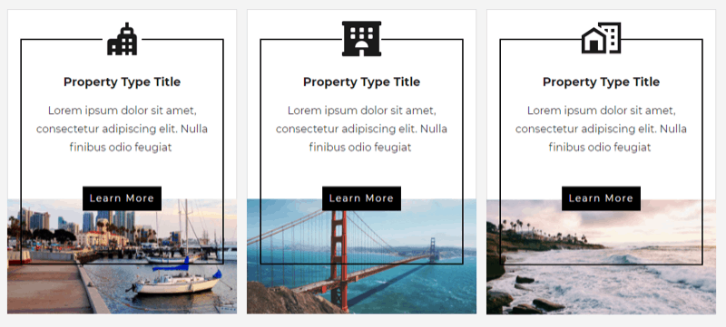
Column layouts with card designs has to be one of the more common layouts out there. That doesn't mean they have to look plain or boring, though. In Thrive Architect you can create some great designs that stand out.
I'm definitely not a designer, but I had no problem creating something that looked highly-designed and dare I say even a little classy.... a bit artsy.

I think those designs look nice, but what really elevates them is the hover state. In Thrive Architect you can choose what happens to an element when you hover over it by first entering the hover state and then selecting specific options for each element. By choosing an outer-most container first, any element you edit in the hover state will change when the original outer container is hovered over.
This is definitely more of a show than tell type of tutorial, so I encourage you to watch the video below.Check out this full tutorial below.
When creating card designs, particularly with columns, I have a few tips to pass along that I think make them look great.
Tip 1: Use a content box in each column as your base layer
Content boxes are great because they allow you to group multiple elements together into one container that can then be duplicated once you have the first one looking just right. They also work great for hover states, as you saw in the video above.
Content boxes can also be placed inside other content boxes, allowing you to create layered effects such as borders inside of borders (or overlaid on top of other content boxes).
Tip 2: Place images below content boxes or inside content boxes with zero padding
This tip lets you create an image that seemingly bleeds to the edge of the box rather than sitting inside which... looks like you just dropped an image into the same box as ever other element.
Adding a really thin, subtle border to the content box then makes the entire design stand out even more.
Tip 3: Use negative margin to create overlapping effects
With just a little negative margin, buttons can overlay images, icons can overlay borders, and suddenly your designs appear to be created inside of photoshop.
Tip 4: Try a little transparency
Transparency and beautiful images always go well together and are a great starting point for creating a design that looks high-end. Transparency pairs particularly well with overlapping elements and content boxes.
Tip 4: Less is more, but hover states give you wiggle room
When it comes to animation hover effects, less is always more. However, hover states give you a lot more room to adapt the look of a design because they're geared toward color changes. You can invert colors, add transparency, or even make things disappear entirely (just a color trick). Even in my tutorial above where I took all 3 card effects and combined them into one single card, it still looked good and wasn't distracting.